Where BSD Fails, and Potabi Aims to Succeed: Websites
Welcome to a new series of articles I will aim to support called "Were <thing> Fails, and Potabi Aims to Succeed", where I mention specific issues plaguing Linux, BSD, etc. With Potabi and CoreNGS being replacements to BSD and Linux, read Potabi's Biggest Misconception: It isn't BSD. if you haven't because it explains that we are not a BSD, just BSD-derived.
When we say websites, I mean ALL websites. I will only be doing active-development BSD-branded operating system websites for most of the big name BSDs, meaning not HelloSystem, AiryxOS, TrueNAS, TrueOS, FuryBSD, etc. Specifically we will critique DragonFlyBSD, NomadBSD, OpenBSD, NetBSD, FreeBSD, HardenedBSD, and GhostBSD. SoloBSD uses a blogspot for the main website, so I will ignore it.
I want to explain why web-design is so important, and how it is often done wrong by the BSDs, and even many Linux distros. And what Potabi does to try and fix it. I am not trying to harass these operating systems, even if I come off as aggressive, or even passive-aggressive, I mean this in good heart. I am tone deaf, meaning understanding how I or others say things and how it might come off to others is something that I struggle with. I want to apologize in advance for any hostile tones that might come from this, I don't mean them.
https://www.dragonflybsd.org/
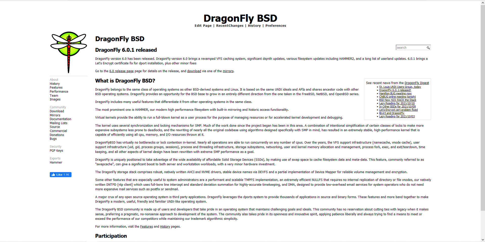
DragonFlyBSD's website is fine, and arguably one of the top two BSD websites. What DragonFlyBSD does right in their website is that it is easy to follow, very simplistic but not "boring" per se. It looks like a project made in 2021, which we will get to multiple sites that have an issue of "non-modern design". You don't want your project to look ancient, and DragonFlyBSD does that perfectly. The biggest issue is that it is moderately newbie-friendly, where the goal should be to be completely newbie friendly. Downloads should be on the main page, as that is what most people want to find.
The download link is https://www.dragonflybsd.org/download/ which is reasonable, easy to understand.
https://nomadbsd.org/
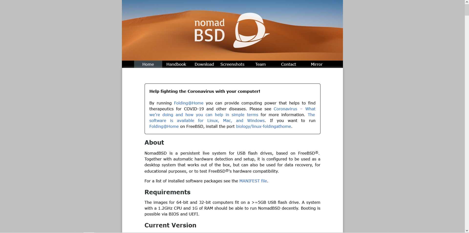
Let's talk half-modern design. NomadBSD's website looks like it could have been made in 2021, and 2001. A more modern design really helps things come together. How do you get modern design? Full-width. The wasted sides are highly visible, and makes the scrollbar look far more intimidating for new users. Not only that, but most of it is blog posts. Never, ever, ever put your main blog on the index page.
The download link is https://nomadbsd.org/download.html which is okay, but the .html - except on chromium and chromium-based browsers actually date the website https://nomadbsd.org/download/ brings you to a not-much-better but also not-worse page full of download links.
https://www.midnightbsd.org/
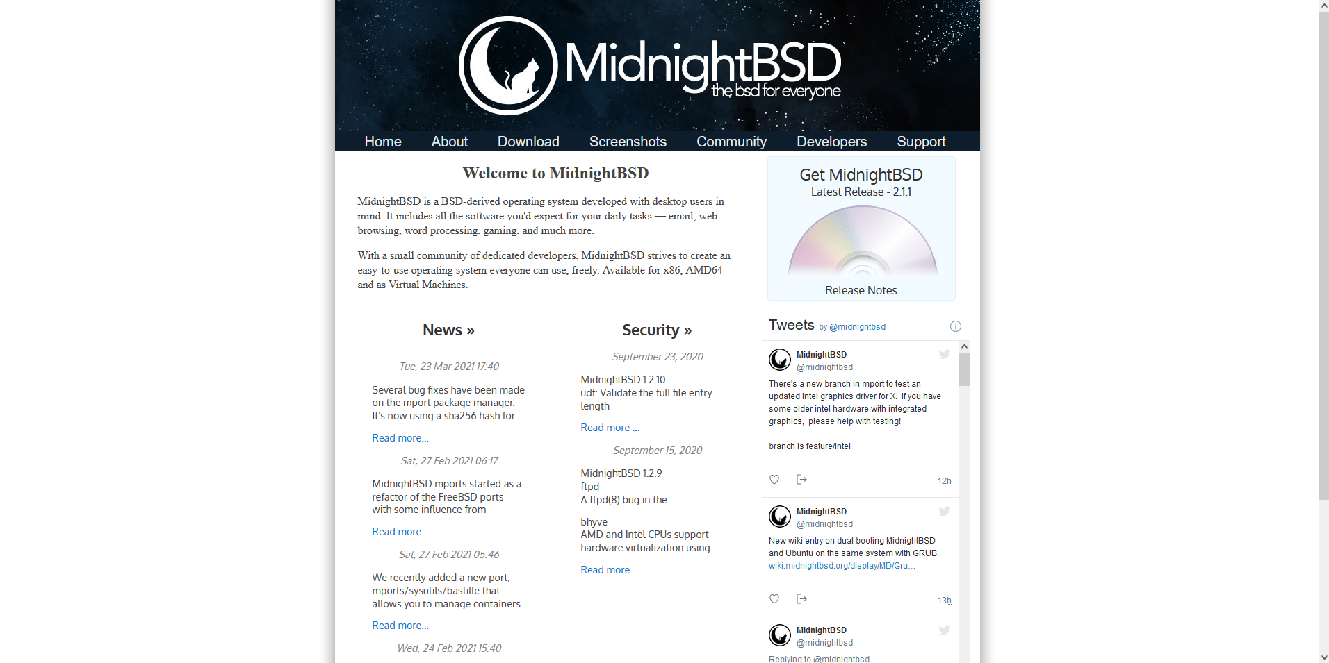
I don't know which came first, the nomad, or the midnight (in terms of website design) but I'd beg to argue this is a step better than NomadBSD's website. They used the same theme/design but here is what MidnightBSD did that NomadBSD should have. First, the blog is condensed and actually delegated to hyperlinks more than full posts. The about is much cleaner. It isn't "stacked", rather dynamic. If you look back on NomadBSD's website, everything follows one after another.
The download link is https://www.midnightbsd.org/download/ which is normal.
https://www.openbsd.org/
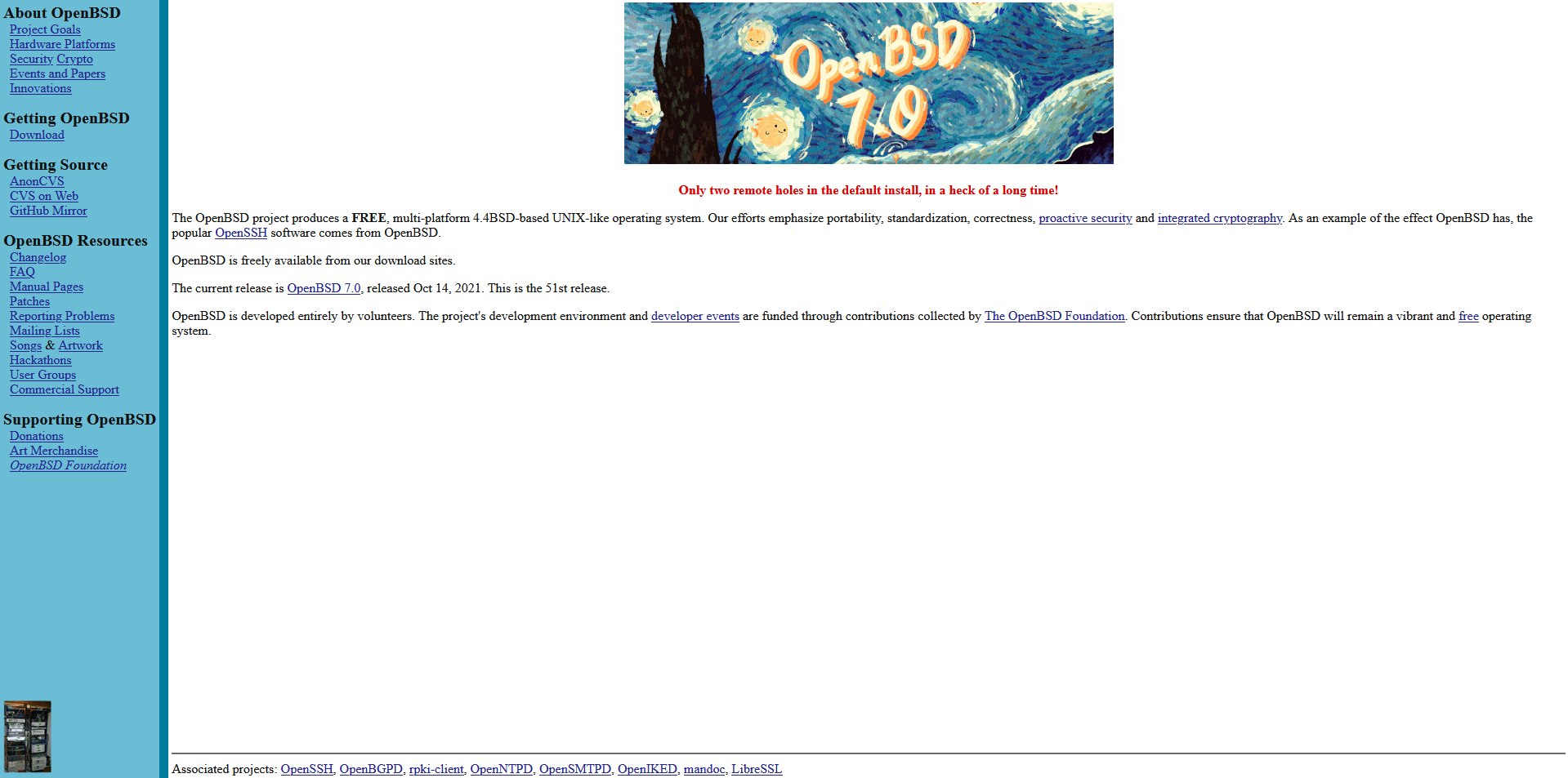
Just because it looks old doesn't mean it looks bad. Of the core three BSD's (NetBSD, FreeBSD, and OpenBSD), OpenBSD has the BEST website. Out of all of them, solid third. Modernization of the website is a recommendation, as getting an older-style to work is difficult. OpenBSD's website could do with a bit of padding, especially on the main text area, but it's pretty wonderful.
The download link, as many other things in OpenBSD, is unique but really well done. https://www.openbsd.org/70.html makes sense as it focuses on the 7.0 release. I would have personally added an undersore, or dash, or dot, but this still works.
http://netbsd.org/
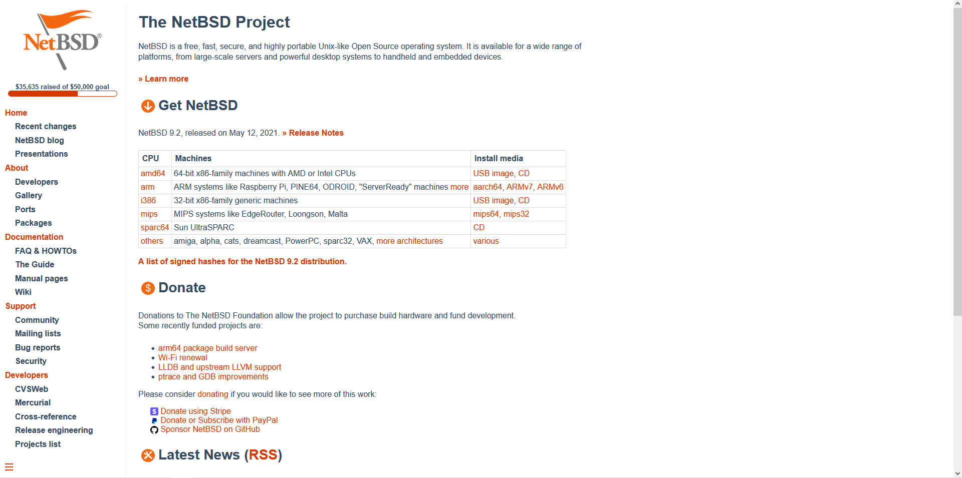
Eh, it's fine. NetBSD's website is basically a more colorful version of DragonFlyBSD's website, and it works. Not too much else to say, it's highly technical, and busy, which is something you want to avoid for new users. Download links are on the home page which is good.
https://www.freebsd.org/
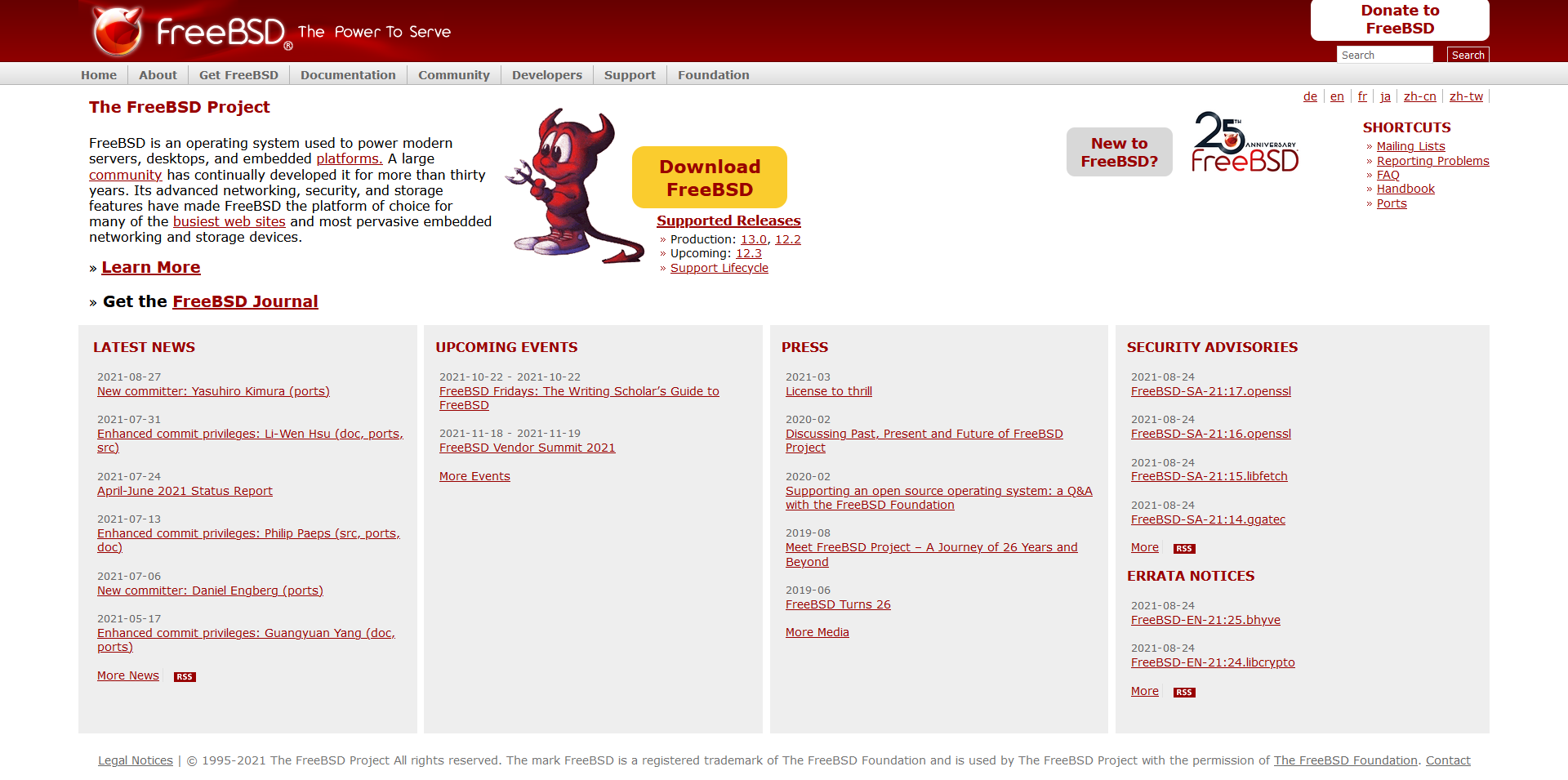
Remember what I said about none of these being aggressive on purpose? I take that back. FreeBSD's website is the epitome of failure. I hate to be so harsh, but it's really a time to nuke and pave. The header and navigation menu are terrible, they mix old and new, and overall looks ancient and uncared for. The main about on the index page is fine, but it's literally one of the two decent things. The downloads section, is terrible. First, clicking on release numbers doesn't bring you to downloads, and the download button, along with the New to FreeBSD and Donate to FreeBSD buttons are severely out of place. The latest news, press, events, and security sections take up way too much space. It's so bad, FreeBSD's creator Jordan K. Hubbard agrees it needs to be replaced. It's not fixable at this point, and it really hurts to see the biggest BSD having a website look like this.
Worst yet, the download link goes to https://www.freebsd.org/where/. WHERE WHAT!? Where to go to get migraine medicine?? NOPE! Genuinely the FreeBSD website is somehow so poorly designed it irritates me. I am angry with a good heart, I want FreeBSD to grow, but the website is the biggest issue when it comes to BSD. It isn't professional, it looks like a half-abandoned hobby project. It needs to change.
Remember that FreeBSD is my favorite of the BSD systems. I don't hate FreeBSD, I love it, I just despise the website.
https://hardenedbsd.org/
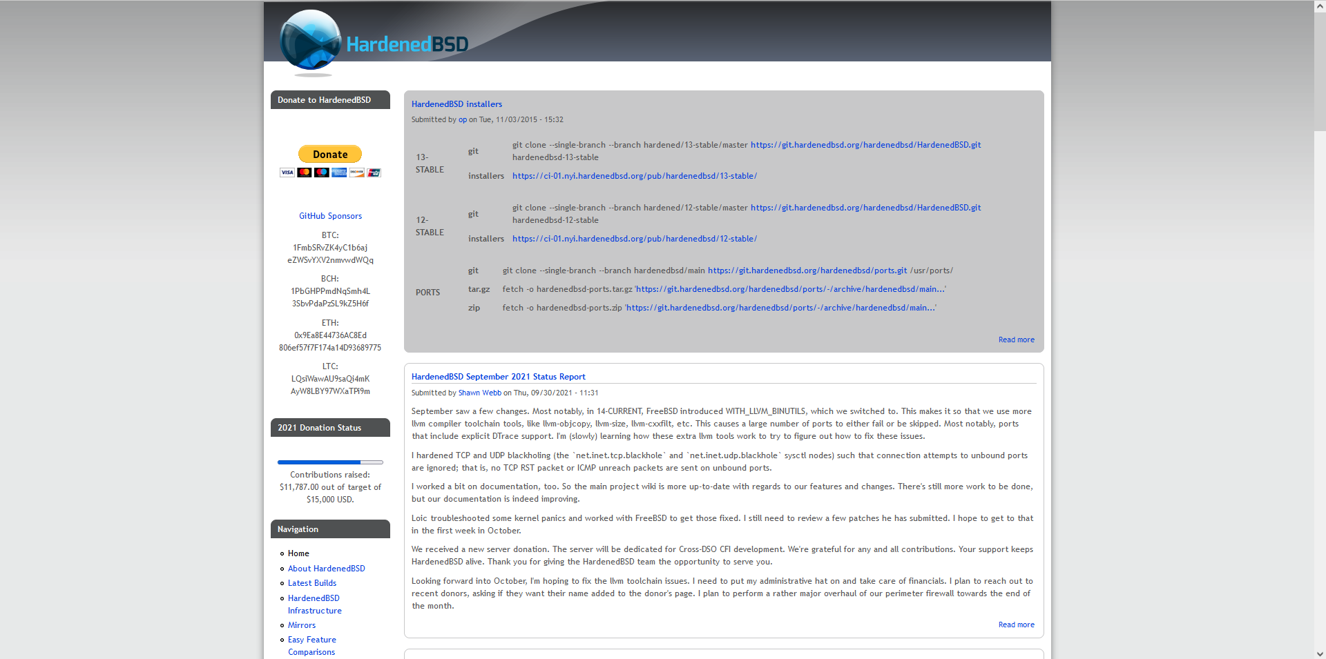
Back to "not bad". HardenedBSD's biggest issue on the website is font. It has poor visibility, and looks old. Adding something like Roboto or something would give it the sprucing up it needs. Really, thinking about HardenedBSD's target demographic, it functions. Less rounded corners would be nice to see, but really this website just works, which is perfect.
Downloads are on the index page which works well.
http://ghostbsd.org/
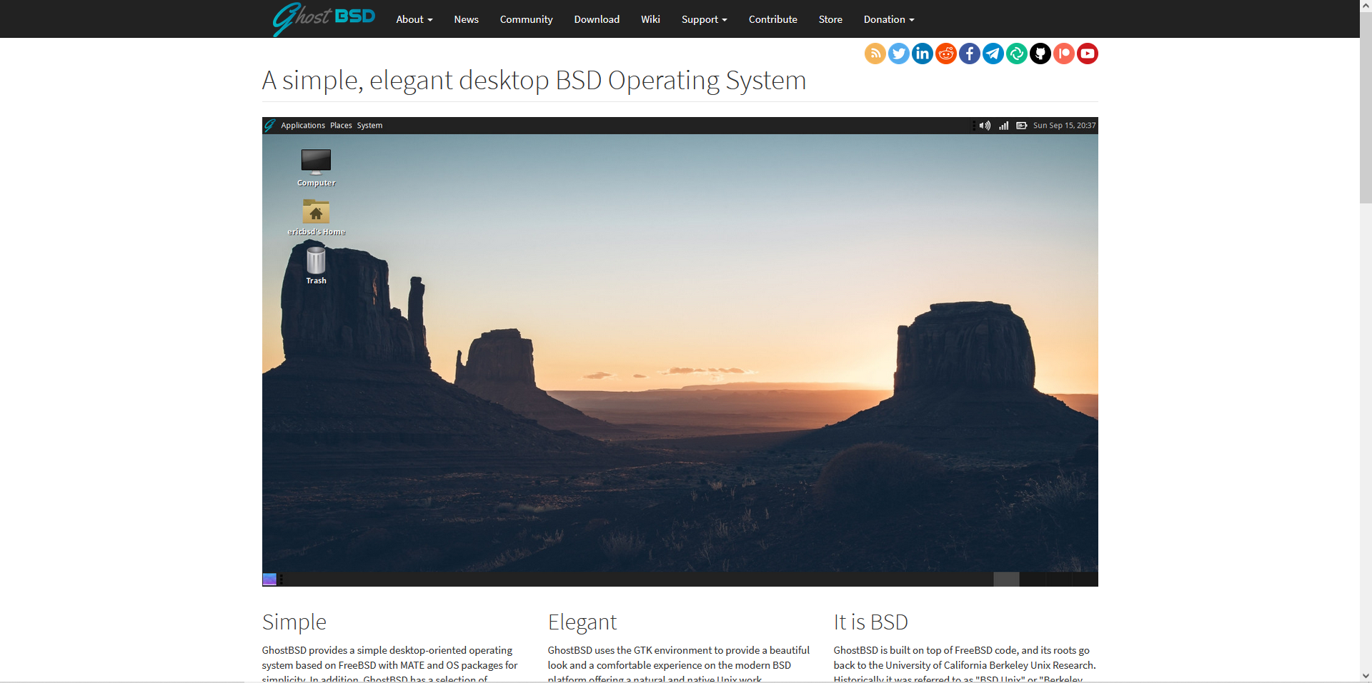
GhostBSD's website is solid, where the only real change I recommend would be making the image smaller. http://ghostbsd.org/download is where downloads are and it fits like a glove. It's the best BSD website, and I argue it is the #1 example.
With our website, we aim to give solid design, simple, well padded, and friendly design. While our website isn't perfect, here is where we try to succeed.
First, look like we care. If it looks like we care about the website - which we do - it gives the impression we care about the website.
Second, htaccess files. A .html at the end of a link is a SUPER SIMPLE fix, and if you can't bother to add it, unless it's stylized (like OpenBSD can be said to be), then you have done bad at website design. Fixing this issue is literally one file.
Third, consistency. The biggest issue with FreeBSD's website for example is some of it looked old yet professional, or new yet inexperienced. Picking one or the other is the way you should do it.
Fourth, not too round, not too sharp. Roundness is good, it makes it feel more friendly, but too much roundness you lose professionalism. A solid middle ground is important.
Fifth, desktop designed, mobile responsive. All websites should be mobile responsive, but since operating systems are desktop-oriented as mobile devices simply cannot support them, you absolutely should design it for desktop-first use, and make it mobile responsive at the same time but not worry too much on design.
Lastly, look professional. Looking like you care or are friendly mix to become professional. You wouldn't go to a job interview with a soda-stained t-shirt with holes, cargo shorts, hoodie, with a cap on. Look professional. Your website should be screenshot and have people go "Looks like what I need for my work." It's how you grow.
We have some work to do still, but hopefully things are are solid enough for people to think a project is professional, cared for, etc. Make your website like GhostBSD, not FreeBSD.

Comments
Post a Comment